
Scene + Heard
Designing a Brand
After writing for Scene + Heard, our campus arts and culture publication, for a year, a few things began to bug me. First off, we did not have a website – we were simply using Medium at the time. Secondly, no one knew who we were because we did not have a cohesive brand. As newly minted Multimedia Editor, I set out to design a brand.


First came the logo.
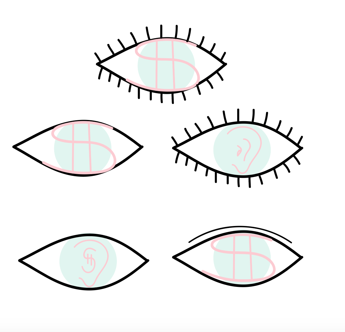
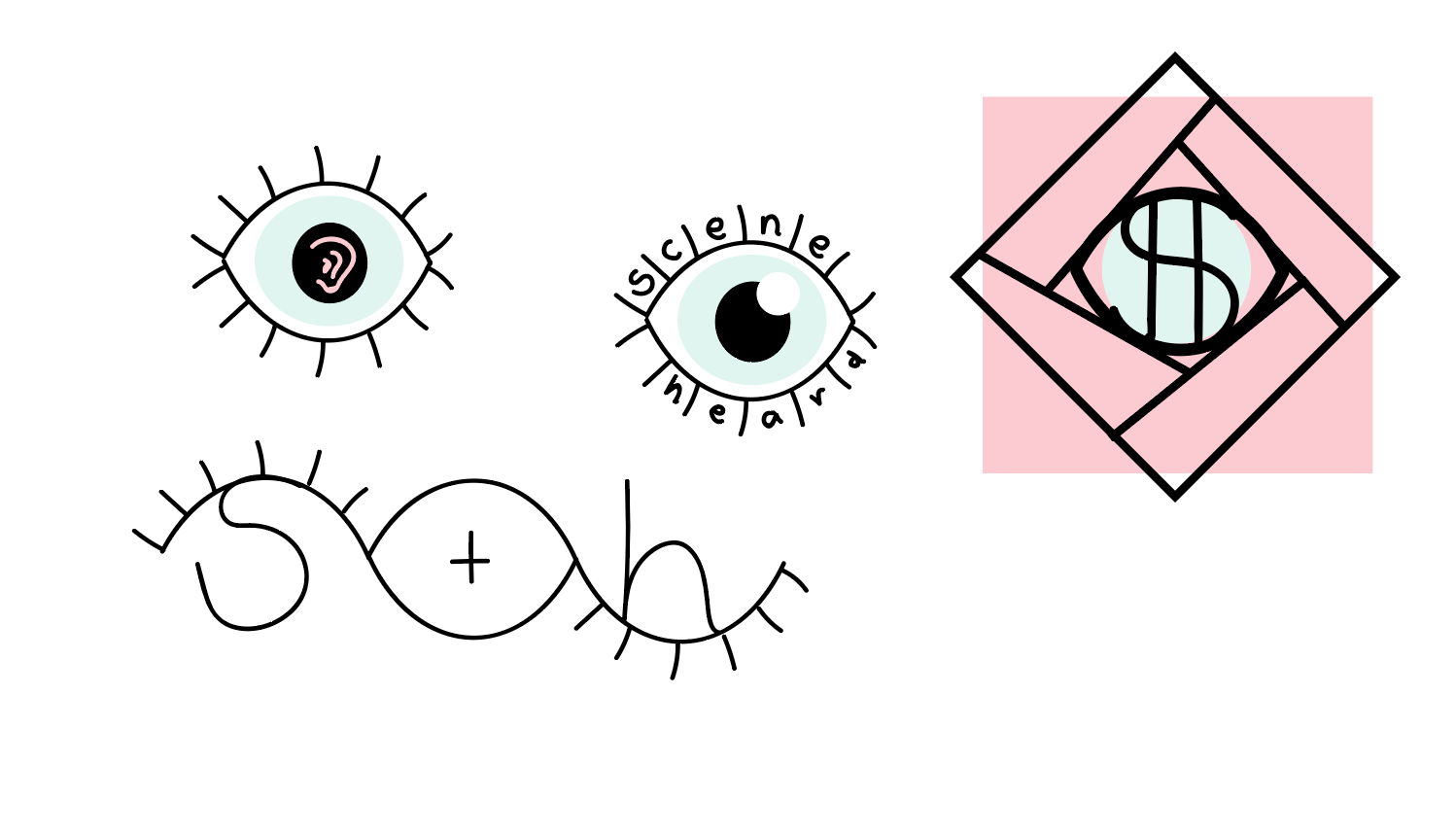
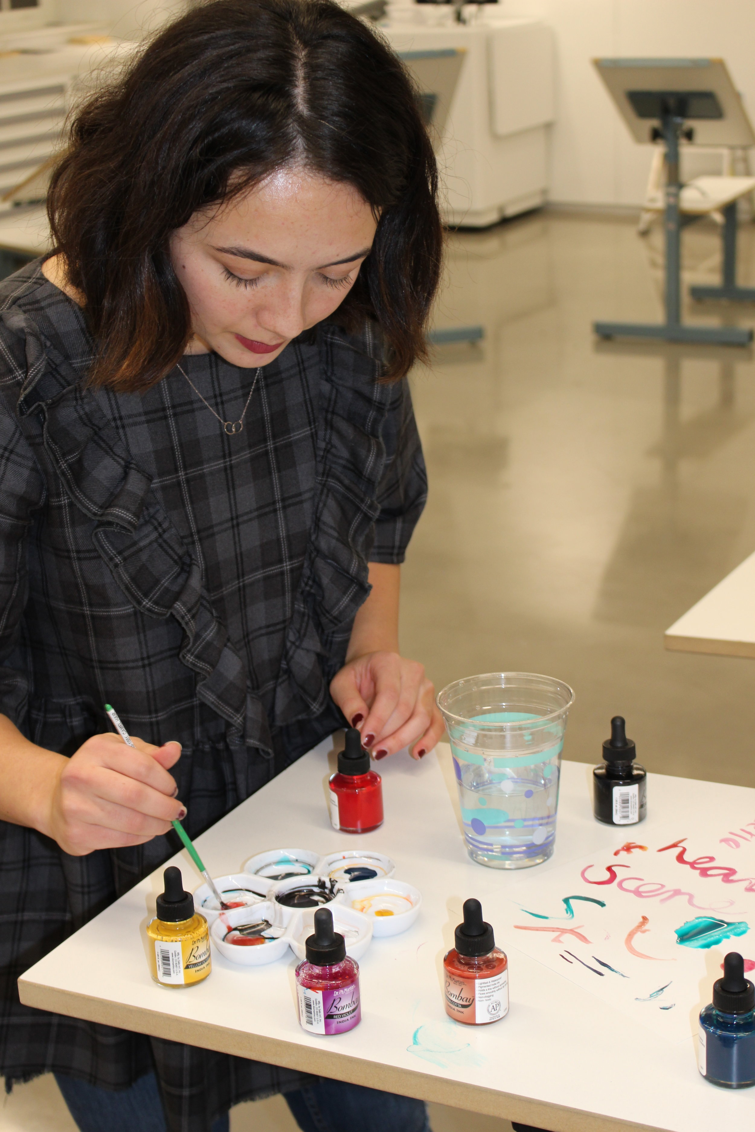
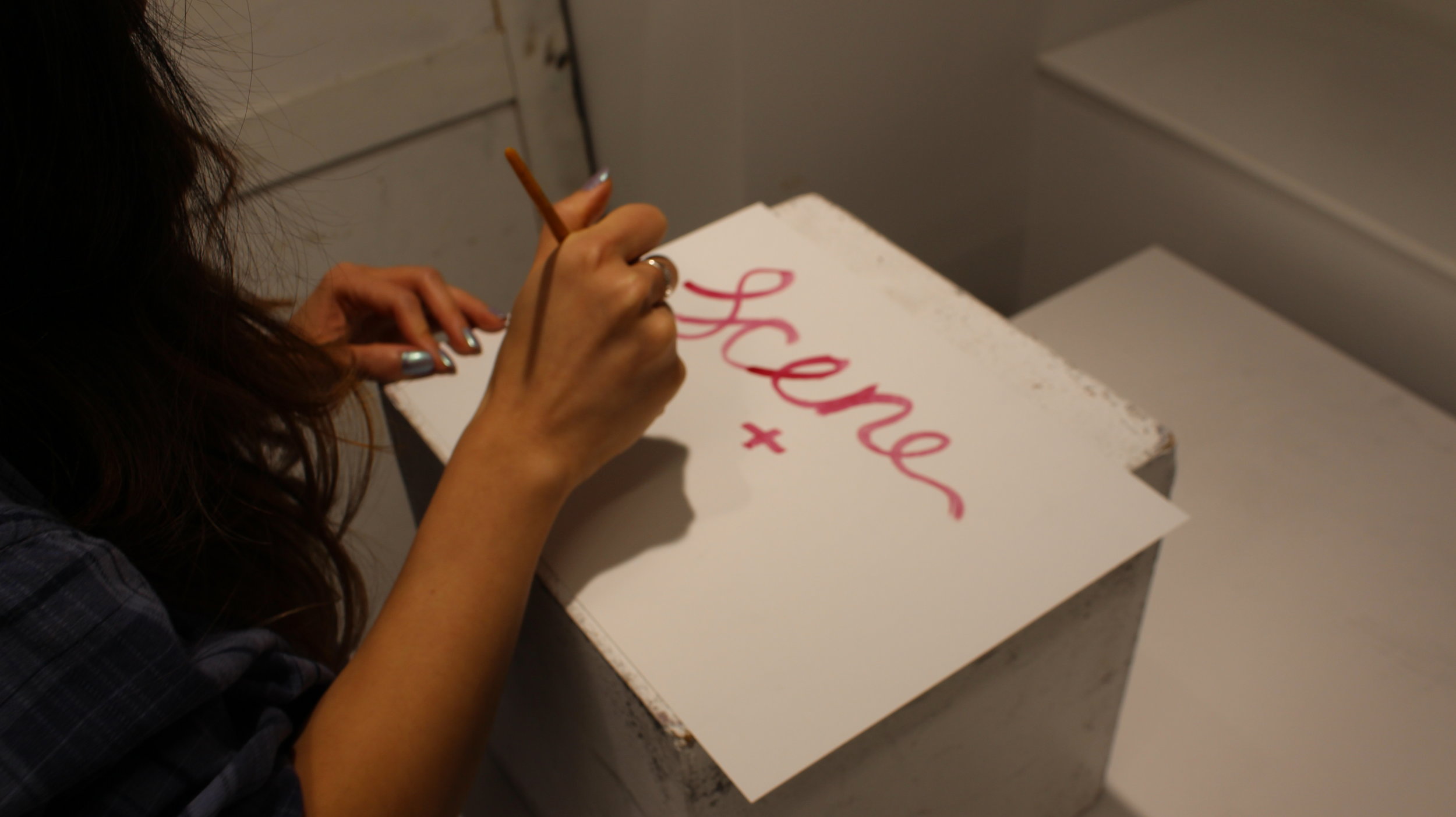
I put together a small team of others interested in design to brainstorm a logo. We put together a mess of ideas, knowing only that we wanted to include an eye and an ear. Because how else would we be seen OR heard?
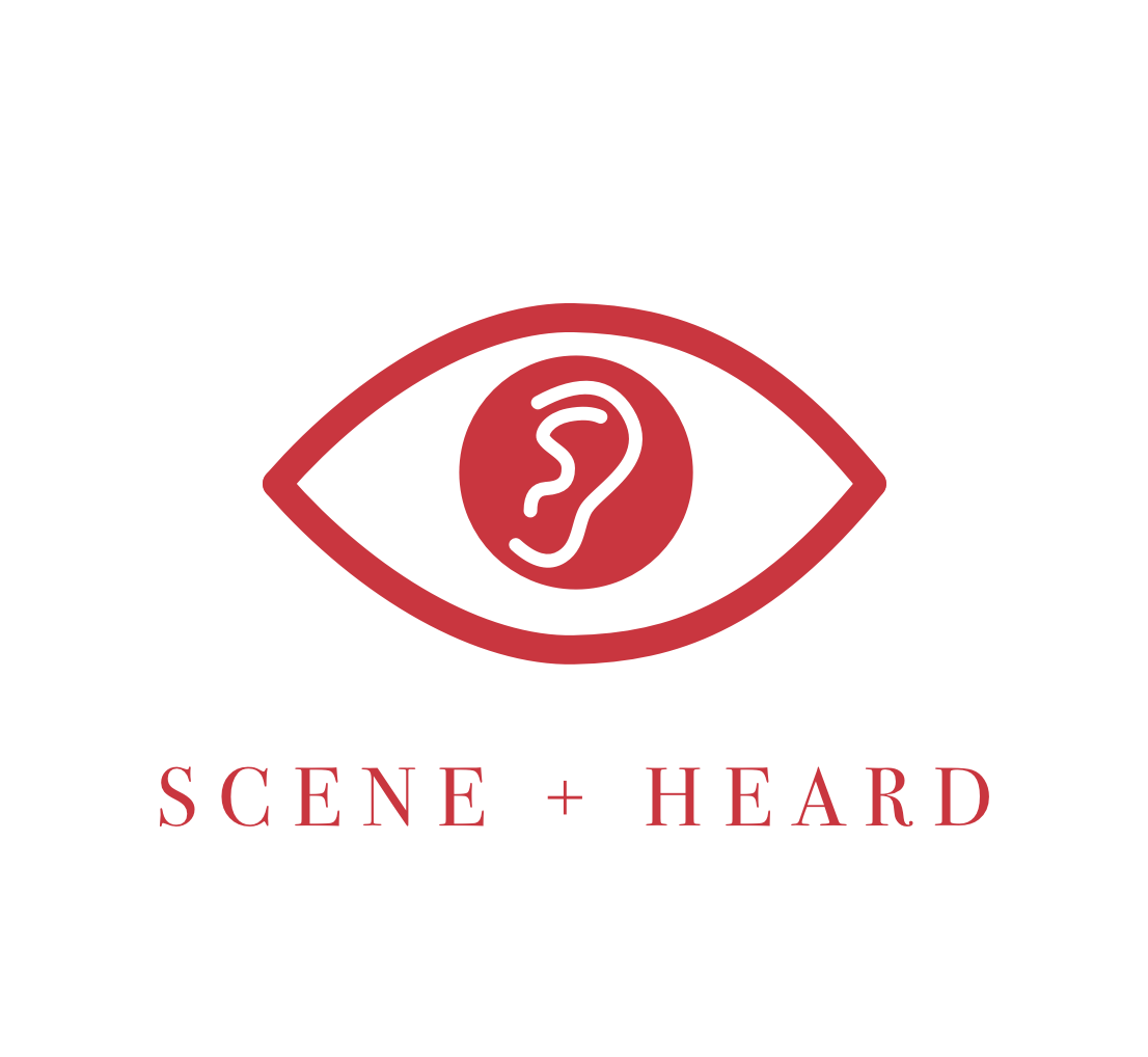
After iterating a bunch of times, we came to a consensus: we wanted something like a cult image, but without the creepiness. Instead, we would be simple and timeless. We chose red as our main color and a nice, classic serif font. And thus, we came to the logo below.
Next came the site.
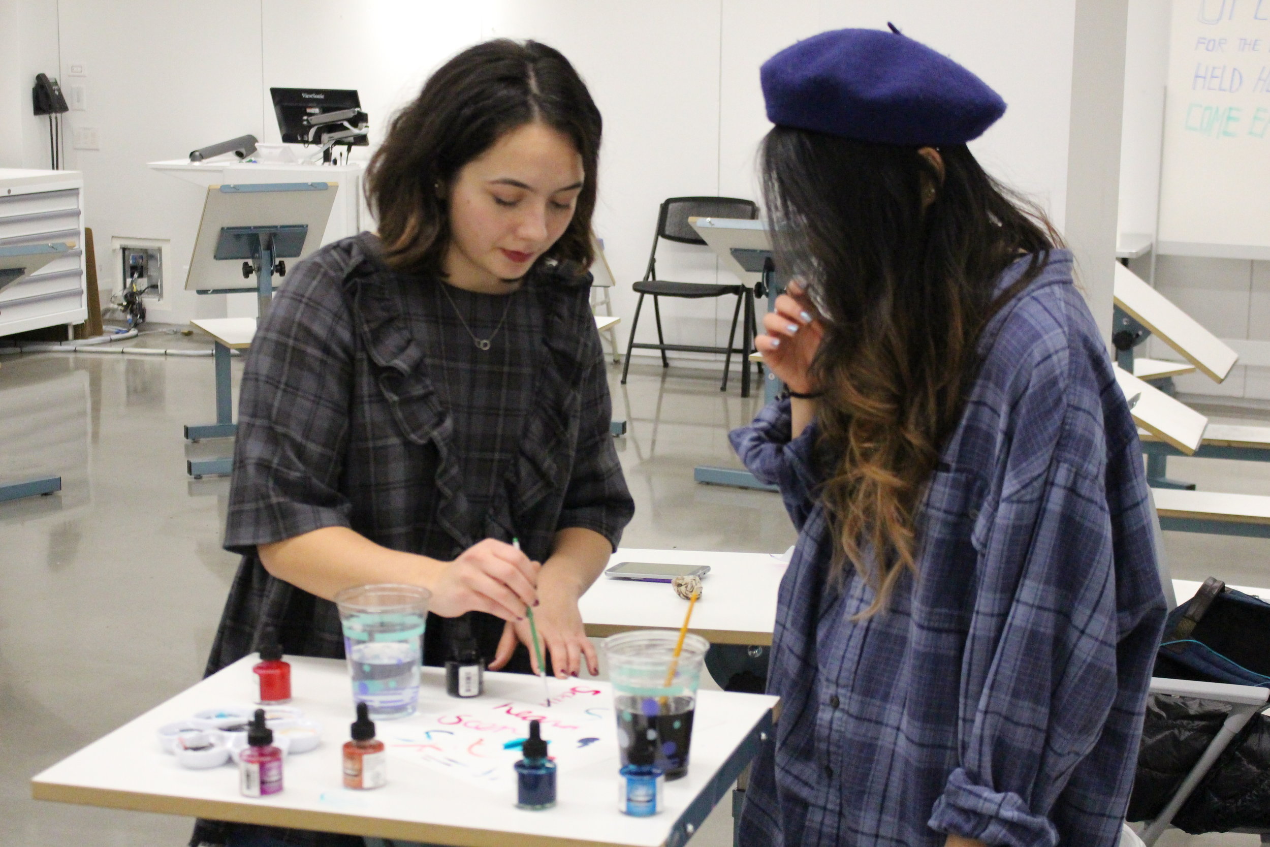
Once we came to a consensus on the logo, I set to work on the site. I organized a media day, and the rest of the Exec team and I spent the better part of our afternoon breaking cookies on camera and filming other odd scenes for the site.
Once we had all the pieces, I began wire-framing the site. I worked with a developer on our team to tag all our stories and put up the site.
Check out the final website here.
Then we relaunched.
Once all these pieces were in place, we were able to recruit a whole new set of writers a re-launch as a full-fledged publication.
As a part of our relaunch, I shot and produced this quick video for our Year in Review.